BLOG
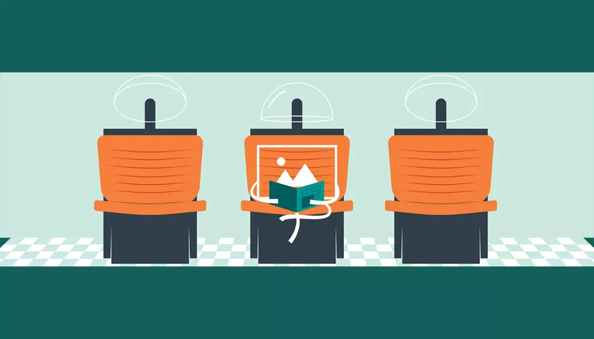
Website, Meet Image - part III
In the last iteration of the Website Image Guide, we dig in to what actually makes an image look good on a website. And a couple helpful guidelines to make sure your images add to your website design and user experience.
April 4, 2019

Reading time: 8 min
|
Digital Experience Strategy

Consistency
When preparing photos/graphics for your website, it is easy sometimes to focus too much attention on individual images. It's good to remind yourself to see the bigger picture, your images have to make sense together. Some of the most successful Instagrammers in the world have a great understanding of how to capture great individual images that also slip seamlessly into a "bigger picture," a.k.a. their "grid." Just take a look at any of the top Instagram accounts right now. All of the accounts have a similar theme that ties their photos together. Whether it's color, lighting, contrast, or just using the same filter, they understand that making photos look great as a unit is just as important as putting out photos that look great on their own. View your website the same way. Here are some websites that have great consistency with their photos...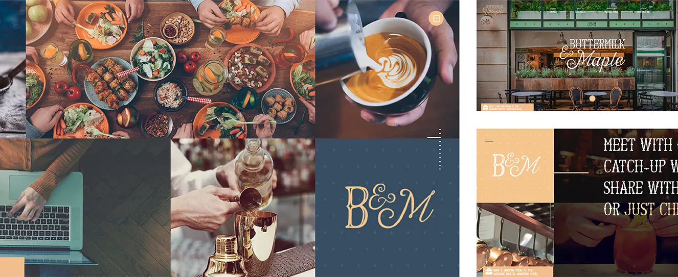 One good example of treatment of website images as buttermilkandmaple.com. All of the images are shot with the same contrast levels and tie the website together with a thoughtful, warm, and inviting color palette. All of this complements the restaurant's image as a comfortable and inviting spot, where the featured item on the menu is pancakes.
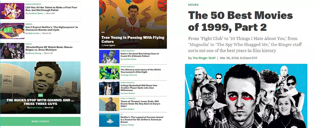 theringer.com also does a good job making sure that their images have a distinct and consistent style across all of their articles. Using bright fluorescent colors contrasted by cut-out black and white images of the articles subject matter, helps the multi-media company bring a message of introducing some liveliness to the topics they cover.
Content Cooperation
Your images should acknowledge the rest of the content on your page! Although that sounds like something that should go without saying, it can get easy to fall into the trap of stock images and website templates when curating photos for your webpages. If you want images that are really affecting, you need to make sure that your website content has a more direct relationship with the composition of said images. Here are 2 areas to focus on when making sure that your photos are in harmony with the rest of the content on the page...Subject Matter
As a general rule, you don't want your website to look like a Viagra commercial. If you've ever seen a tv advertisement about ED before, you'll know that their blatant disregard for the actual subject matter of the commercial borders on the absurd. And sure, it's funny to watch a pharmaceutical company stumble while trying to pair visuals with the sensitive subject of "male performance," however difficult the job might be. Fortunately for most of us, we don't have this predicament when we are planning out the visuals for our websites. So why is it that so many settle for "b-roll" stock photography when they are looking to fill up their pages?Here is a helpful thought experiment; If all the copy is removed, would a visitor still have a good idea what your webpage was about? If the answer is no, then most likely your images aren't working with your content the way they should. If you have a page talking about collaboration within your team, don't settle for a stock image filled with coffee, laptops, and sticky notes; take a picture of your team in their natural environment! Looking for a header image to go along with your company's social event? Don't use a picture of beer mugs clanking together or a party hat with confetti, designate one of your team members as the picture taker for the event and get some great authentic photos. And if you are worried about the quality of photos taken by team members, or the cost of a professional photographer, remember the statistics from part I of our series. Bad images decrease engagement and can end up costing your company much more money in the form of lost website visitors than the amount of money you'd have to spend on a photographer.
Composition
When images are at their very best, they blend in seamlessly with the rest of the content on the page. Composing your images specifically for your website requires a little extra planning, but in the long-term ensures that you have a great relationship between said images and your other content.The first trick is making sure that you wait for the wireframes! With wireframes in hand, you or your photographer will be able to plan a photo shoot with optimal framing and negative space so that every image fits perfectly into the puzzle of your webpage. A carefully planned image can even elevate the user experience of the website, using lines and shapes in a way that leads a visitor's eyes through the page, or directly to important information. So to put it simply, if you want photos for your website, shoot photos FOR your website. Remember, even the best looking images can look sub-par in the context of your website if they weren't meant to be there, and they might even detract from what you really want people to see on the page.
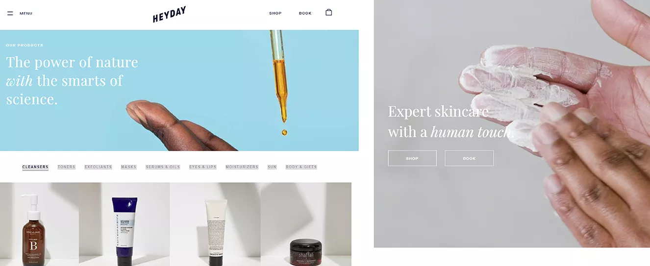 Looking for a website with exceptional images? Look no further than heydayskincare.com. At Heyday, they have broken from the industry norms of over-produced fake looking images and buzzwords, by pairing simple copy along with affecting and relevant imagery. Also notice the careful composition of their photos. Even the video playing on their home page acknowledges the headline by always keeping the subject matter towards the right portion of the screen, and using the motion of the hands to lead the visitor's eyes to the CTA. The beauty in Heyday's overall website design is simple. Although the copy and imagery on the page are both fairly plain and clean, when combined they elevate each other.
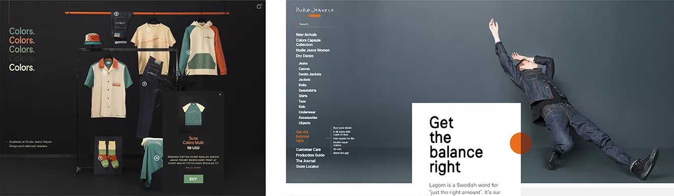 nudiejeans.com's website displays composition at it's finest. The "closet" layout is a unique take on the generally uniform design of online retailers, and works well with the aptly colored headline text to the left of the clothes. The edge to edge picture paired with well-placed copy perfectly blurs the lines between photo and text, creating a seamless user interface. And in the category of imagery relating to subject matter, the "Get the balance right" portion of their home page takes the cake. It would have been easy to use a typical photo when describing their use of sustainable materials in the making of their jeans. Instead, they thought out of the box with a more literal interpretation of balance, and in the meantime gave the page a more dynamic and interesting look. When the design of the page and the content work together, the result is a great looking website, and Nudie Jean's site is a prime example.
Filling your website with content is a stressful process, and can either bring your site to life or send it to an early grave. Making sure that your images are contributing to the success of your site and not the other way around is important. While we covered the effect that file type and size can have in parts I & II, the content of your images is also crucial to their performance on your pages. In other words, they have to look good too! Stay consistent, and make sure your images and copy are cooperating with each other. A website designed to have all of it's elements working in harmony will make every visitor's experience more enjoyable, and at the end of the day, will elevate your brand.
Latest Blogs

| CMS & Custom Development
Using AJAX and MVC for Filtering and Paging a Directory
Learn how to build a dynamic resource directory with AJAX and MVC, featuring filtering and paging for a seamless user experience.
June 5, 2025
Reading time: 8 min


| Inclusive Design
Why Accessibility Isn’t Optional: Celebrating GAAD at High Monkey
Recognizing Global Accessibility Awareness Day with resources, insights, and episodes from our podcast that promote inclusive digital experiences.
May 15, 2025
Reading time: 3 min


| News
High Monkey at ACCELERATE 25
High Monkey had a blast at ACCELERATE 25! See what we shared, who we met, and how we’re helping credit unions improve their digital experiences.
April 24, 2025
Reading time: 2 min
Your success story starts here
Contact us for a free consultation, and let’s work together to build a strategic plan that tackles your challenges and lifts your organization to a new level.